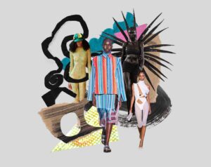
In the midst of expectations and anticipation of the newly revised curriculum and the introduction of the new faculty, Ryerson Fashion is undergoing changes to continue shaping the industry through modern practices and multiple perspectives in the twenty-first century. Ryerson Fashion in need of reformation, seeks their own voice in the form of a visual blueprint that is crucial to the program’s changing core values of interconnectivity and social/cultural progressiveness. The result was the antithesis of subtlety, and its impact opened new possibilities of shaping Ryerson Fashion’s future.
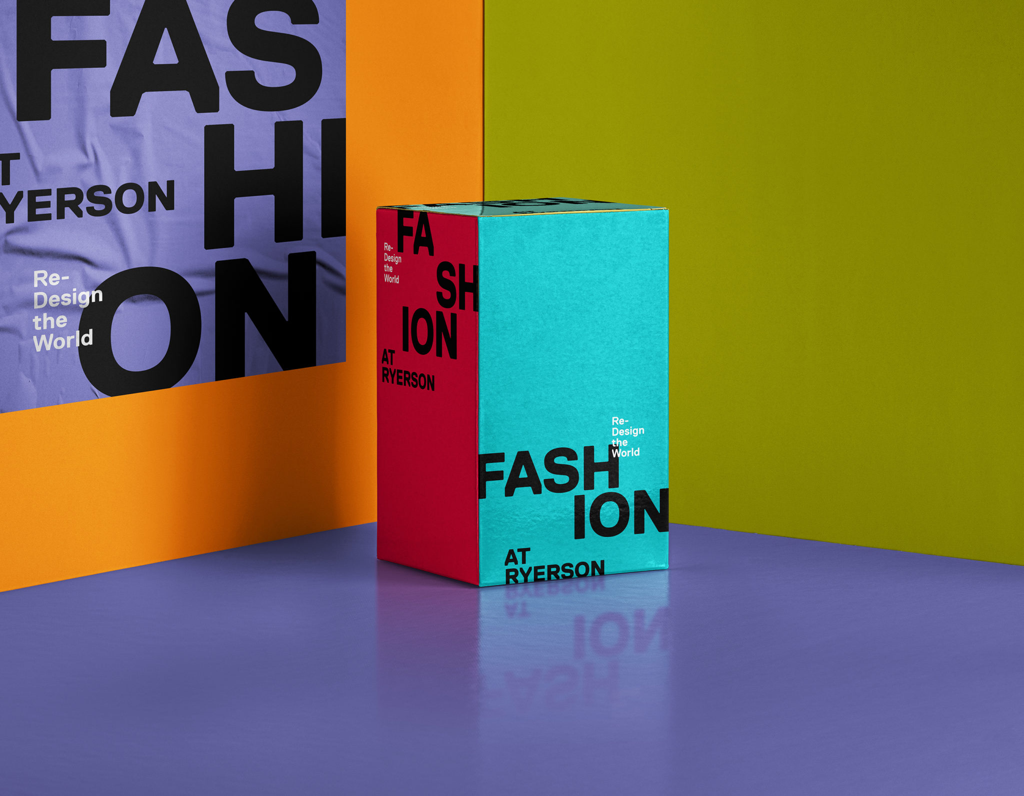
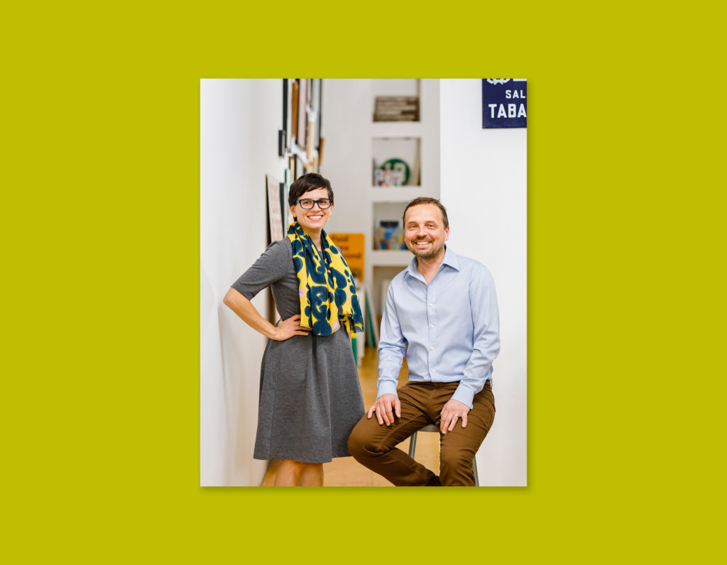
Melissa Agostino and Henry Tyminski, creative directors of Sali Tabacchi Inc, a Toronto-based branding and design studio, broke the mold of standard Ryerson branding codes and transformed Ryerson Fashion’s layouts and typefaces into forms of dialogue that speaks loudly and boldly without apology. Abiding by the Ryerson design codes and typefaces, the duo created a form of visual identity that expressed its own personality without the rigidity and concrete forms of the past. It utilized the importance of words that is engulfed in a sea of colours which firmly stands as a testament to a new era of inclusion, decolonization and sustainability.
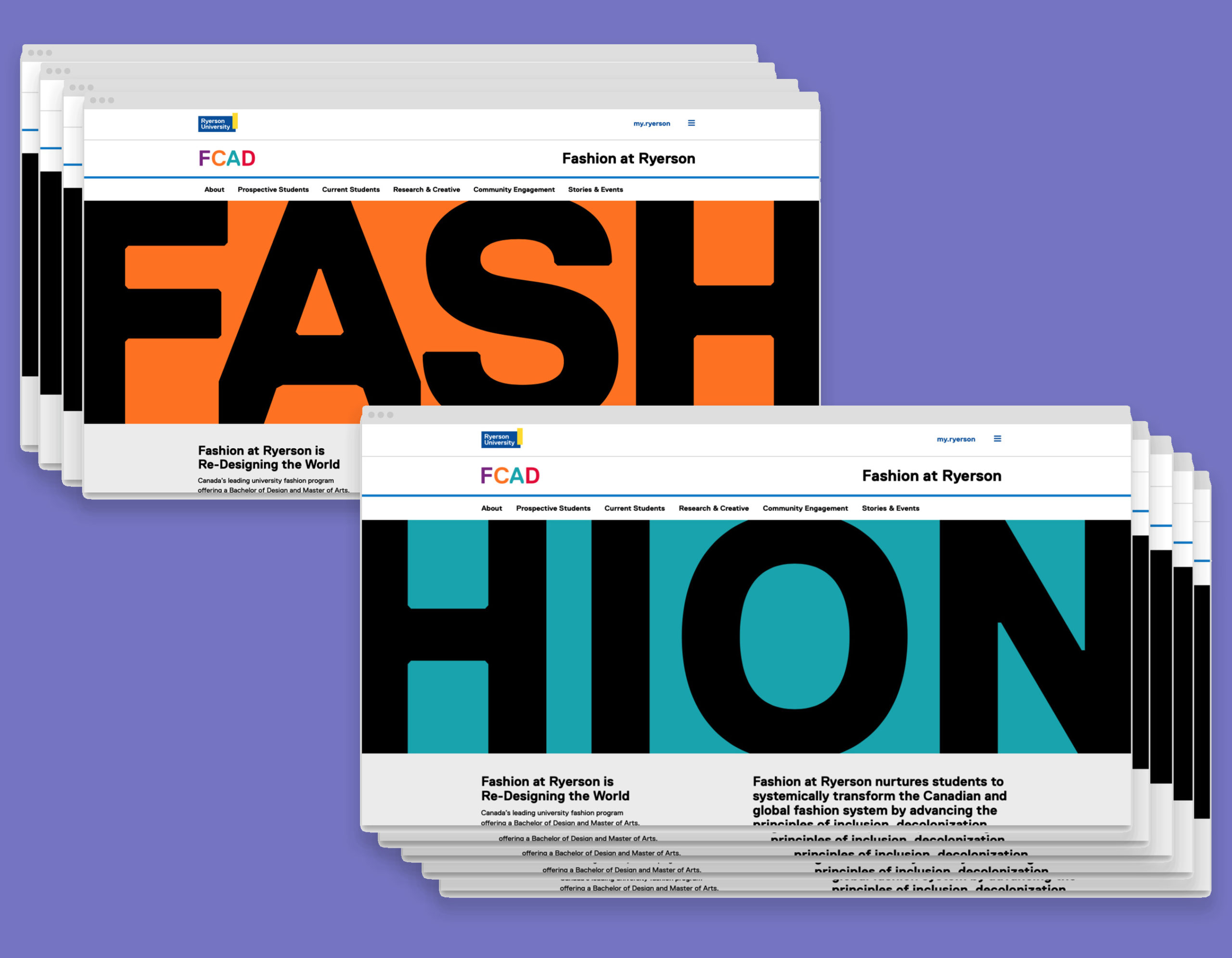
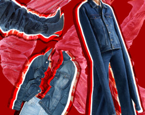
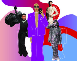
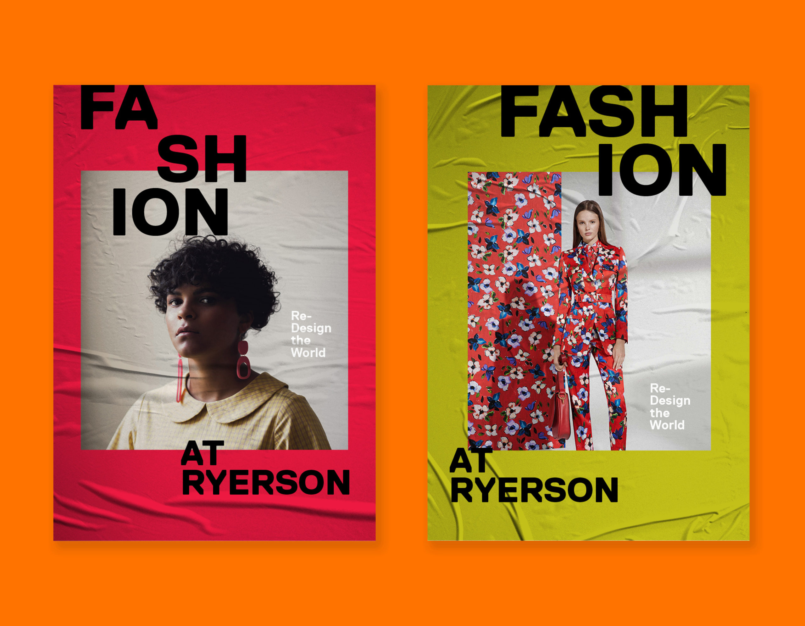
On their first Instagram post, it was first seen in stark contrast with a bright green square along that yearns for attention and freedom with the deconstructed use of the word “FA-SHI-ON” in bold Replica text- it holds no rules or constraints. The layout set its own disruptive rules and boundaries, breaking down each letter and each word to its analytical state. It dissects and deconstructs the very surface nature of the word “fashion” whose reputation is presumably associated with frivolousness and superficiality by the mainstream audience. This design challenges this notion through a grand, explosive entrance and its presence loudly screams.
The duo believed that “design can do more than convey an idea. It can tell a story!,” according to Melissa. The introduction of a completely new vision bolted Ryerson Fashion’s story to the forefront which was when the audience realized that change is going to be made and is now fully realized.
Melissa Agostino and Henry Tyminski founded Sali Tabacchi Inc in 2007 with the ethos of clean, simple and modern design, along with a playful, creative approach after working in one of Amsterdam’s top creative studios. Since then, they had been working with multiple clients including CBC, Hudson’s Bay, and Ryerson’s Architectural Science program. They have also been the former art directors of Azure and Designlines magazine. We had a great opportunity to talk with Melissa about their perspective of Ryerson Fashion’s new visual direction and how it came to be.
- What was your first impression of Ryerson Fashion as a program and how does their ethos of “re-designing the future” take into consideration with your visual direction?
Melissa: We were excited by the department’s enthusiasm and vision for how they wanted to move forward Fashion at Ryerson. We wanted to help them re-focus the visual identity to help accomplish their goals of creating an inclusive and sustainable future in fashion. Together with the Ryerson team, we were able to identify “Re-design the world” as the messaging that we could use in collaboration with a new visual identity for the department.
- Please tell us a little bit about your creative process when working on this project. What was the collaborative process like re-designing along with the Ryerson Fashion faculty and the relationship between your studio and the faculty working alongside.
Melissa: We definitely wanted the visual look and feel to be forward-looking. Since the vision of Fashion at Ryerson was to move away from the status quo in fashion by creating more inclusive and sustainable perspectives, we also wanted to start fresh and not look too much to the past.
- Could you explain your stylistic choices behind the visual direction and how these aspects reflect the characteristics of the program’s message? What is your inspiration or starting point behind this direction?
Melissa: Typography is a powerful communication device, it’s not just what is said but how can be visually express this to emphasize the meaning. We felt we could go bold to mirror the big changes that are happening in Fashion at Ryerson. We also wanted to leverage the existing tertiary colour palette in the Ryerson brand guide – bright and bold, perfect for creating the identity for Fashion while still remaining within the Ryerson style guidelines.
In addition, our goal was to create a bold framework, allowing the work of students and faculty to shine not to over-power it with extraneous visuals.
- As Ryerson Fashion is completely changing their image, what advantages/disadvantages did it leave you as a designer to provide? Do you feel like you hold a responsibility in visually communicating their message successfully?
Melissa: Yes. We spent time listening to the team about what the department is about. We wanted what ended up being communicating to feel authentic to the Fashion at Ryerson department. We don’t approach visual identity projects as just designing something for the sake of designing something new – the end result must fit in with the values and perspectives of the department. It should align with where they want ideologically in the near future and beyond.
- Your studio has an extensive portfolio of architectural or interior design related projects and have worked with Ryerson in the past for their Architectural Science program. How does this particular project differ from your previous project with the Architectural Science program and does it affect your design approach or process?
Melissa: We really enjoy working with other creatives. Even if we are creatively in different disciplines than graphic design like fashion, interior design, architecture or product design etc, usually there is a collective desire to capture the spirit of the project.
For Ryerson Department of Architectural Science department, even though it was quite a different visual result – and Fashion at Ryerson are actually quite similar. Both departments want to stay true to their ideals and at the same time to be authentic while connecting with their audience: students, faculty and professionals in their fields and beyond.
- What were the limitations/difficulties faced when working on this project, especially working with a large institution such as Ryerson? How does your team navigate these difficulties or overcome barriers?
Melissa: Sometimes limitations are useful when designing a visual identity – it allows us to focus on how we can make it the best result within those limitations. In this case, we needed to stay within the existing Ryerson-wide branding (fonts, colours etc) but also find a way to create a fresh new bold look for Fashion at Ryerson. It was a fun challenge and a great exercise to see how we could push the Ryerson branding a bit but not straying too far from it.
- Having to explore a multitude of platforms (digital and print) such as web design, social media, posters, etc. for this project, how does that take into consideration when designing the brand identity?
Melissa: Knowing ahead of time that whatever we designed would have to seamlessly work on many different platforms, we try to keep the design as flexible and malleable as possible. We try to approach all visual identity work as more of a system rather than a singular design element – that way the look and feel can expand and contract as needed to work virtually anywhere.
- What are your hopes for the future of Ryerson Fashion and their newly found visual direction?
Melissa: We are thrilled that inclusivity in the fashion world and diverse voices and viewpoints are being heard. Body positivity, environmental sustainability and decolonization is also so important to explore in fashion. The depth of research and teaching in the Fashion department at Ryerson is impressive and refreshing.
We are so excited to see the big changes and for current and graduating students change fashion and re-design the world!
Special thanks to Melissa and Henry for your creative insight.
https://salitabacchi.com/
INSTAGRAM @salitabacchi