Feature Graphic by Lesley De Boer
As the year comes to a close and a new Pantone colour waits on the horizon, we’ve decided to take a look back at what exactly the Pantone 2018 colour of the year has gifted us. Here’s the story of Ultraviolet.
The Announcement
Once upon a time, in the land of the monarchy, the only people allowed to wear the colour purple was the royal family. Purple is a colour that represents wealth and power due to the high costs of dying fabric into such a rich purity. Purple screams royalty. Queen Elizabeth I even forbade anyone in her kingdom to wear purple except for the closest royal family members. So, given its exclusionary and elitist nature, when the Pantone Color Institute announced that Ultraviolet 18-3838 was the colour of 2018 many were left a little confused.
Wouldn’t it have made more sense for the colour of the year to represent the transforming and progressively inclusive society we are encouraging? For example, in 2016, Pantone announced two separate colours, rose quartz and serenity (pink and blue), to represent how society was becoming a greater support of a gender-fluid world.
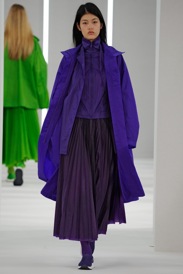
Why?
Pantone’s response to their 2018 announcement was that instead of focusing on how the world is, they were focusing on what our world needs: creativity. It is important to address that Pantone did not pick ‘purple’ to be the colour of 2018, but picked a colour that Leatrice Eisman, executive director of the Pantone Color Institute, stated as “the most complex of all colours…because it takes two shades that are diametrically opposed – blue and red – and brings them together to make something new.”
The word ‘ultra’ means ‘beyond’ in Latin, so perhaps Pantone is signalling that we need to look at external sources for artistic inspiration and spiritual reflection of our society. Ultraviolet is also known for acting as a light which reveals hidden, underlying layers. Some everyday examples would be that Ultraviolet light bulbs actually are what creates the glow in the dark atmosphere in attractions (think: glow-in-the-dark mini golf!) This colour also brings out particles on our clothes that are usually unnoticed. White clothing specifically sticks out because there is no coloured dye preventing particles from being hidden. Ultraviolet light is also used when sterilizing medical equipment so that it is ensured that no leftover cross-contamination of substances can occur. Ultraviolet light is of a higher frequency than the visible light the naked eye can see, so Pantone is perhaps suggesting that we should search for inspiration in places that have remained dark to us in the past and use the colour Ultraviolent as an exploration tool.
The word ‘ultra’ means ‘beyond’ in Latin, so perhaps Pantone is signalling that we need to look at external sources for artistic inspiration and spiritual reflection of our society.
– – –
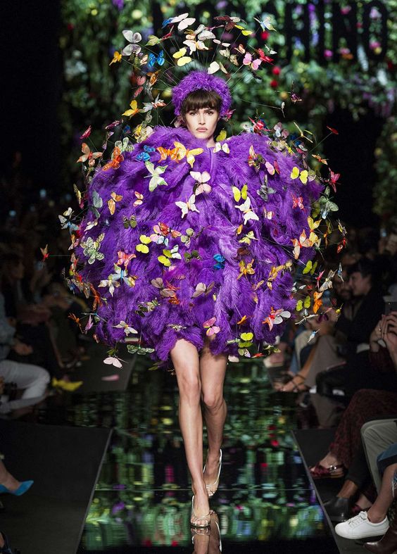
Pantone has been picking a colour that captures the zeitgeist since 2000. The colour is selected by an invited committee of 10 in a European capital twice a year, which is done months before it is officially announced. The whole process is very hush hush and few are fully aware of how the committee agrees on a final colour to represent a 12-month span of time. The process for selecting a colour is primarily qualitative and is done in accordance to the global mood. For 2018’s colour they gained inspiration from diverse places such as meditation-studio lighting, health foods, developing trends and outer space. Ultraviolet was announced as the 2018 colour on December 7th, 2017 by Leatrice Eisman, executive director of the Pantone Colour Institute, and was published in Pantone View.
Pantone chooses a colour each year to inspire designers of all kinds to incorporate the colour into their new creations. They provide colour pallets and possible colour combinations for inspiration and partner with different companies to further establish that the colour they have chosen is worthy to be incorporated in the designs of the year. For example, Butter London, a colour cosmetics and nail care brand, created an entire collection focused on the colour hue of Ultraviolet. Another example is e3light, a Scandinavian furniture company, who created a design line of Ultraviolet based pieces that would play with light and distinctive rich tones.
Pantone leaves the decision to designers to choose whether or not to use the colour they believe will represent the year best. However, John Crocco, creative director at Perry Ellis, stated that if designers choose to follow the colour predictions they will become “part of what ultimately becomes a trend.” It is decidedly best to not ignore trends when they relate to designs because you will otherwise be left behind. Designers are in a career that should be closely up-to-date with creative trends, whether fashion, interior design, graphics, etc. Much like the title of the 1989 sports film, Build it and they will Come suggests, by Pantone providing a projection of a colour as a symbol of the year, others, too scared to risk irrelevance, will follow suit and use it in their creations.
So What?
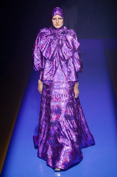
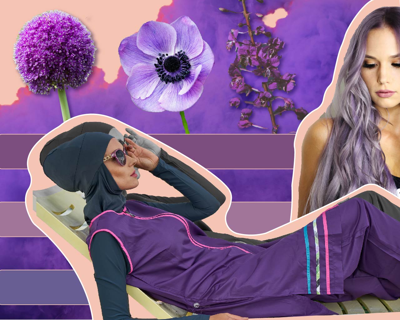
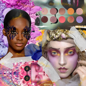
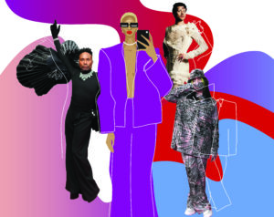
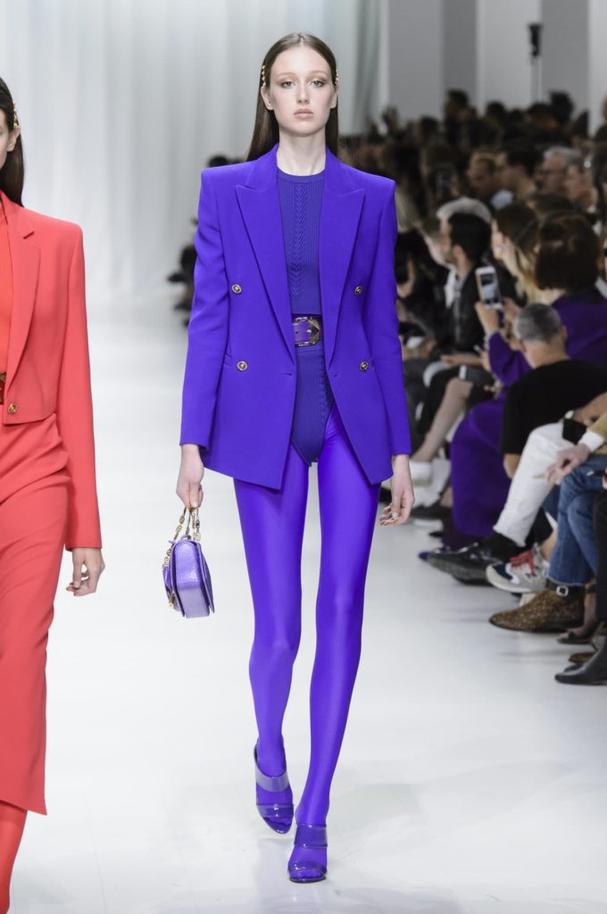
As a result, many designers chose to use the colour Ultraviolet in their designs following its crowning as colour of the year. Ultraviolet suggests the complexities of natural gems, florals, and luxurious textures, such as velvet or satin. It is a colour that adds a level of sophistication to advertising and makes an elite statement, accenting darker colours flawlessly. It has a level of mystery while remaining modernly relevant, which is popularly demonstrated by Sephora Pantone Universe lipsticks and eyeshadows. This colour has become recognized as symbolic to certain people, such as the late singer Prince, and remains distinct, recognizable, and popular. When Meghan Markle hid her baby bump by holding Ultraviolet folders, the same folders started flying off the sales racks at 75% faster rate. Fashion designers created outfits specifically to match the new colour of the year. Gucci’s spring-summer 2018 collection was filled with purple looks that were presented under an Ultraviolet stroke light, which included eclectic pantsuits and decorative accessories. Needless to say, the Pantone colour of the year definitely impacted the way that designs were created for consumers over this past year.
It is vital to keep up with Pantone’s predictions because it transforms the way design is presented in the everyday. This colour had some notoriety before Pantone anointed it, but it is now a distinct trend that we unintentionally follow and look out for. It has a stigma for creating an impression before even communicating a message with words. Once we can recognize a trend for what it represents, the world of design will be easily understood to an extent never perceived.
Regarding Pantone’s mission for Ultraviolet, it would be fair to evaluate it as satisfactory in adding a creative goal for designers to reach beyond their usual creations. The colour of the year gives direction of meaning and purpose to the world of design, even when we’re not aware that we’re following it. With the announcement of the 2019 colour Living Coral, it’s without a doubt that, much like its precursor Ulraviolet, it will seep into every aspect of our environments and selves. Just as the architect Frank Lloyd Wright wore a purple cape while trying to draw inspiration for his new designs, the author of this article also wore a purple shirt while trying to convey a message of Ultraviolet distinctively.
