In fashion, as in everything else, there comes a time when we all could use a fresh start.
But with the case of Burberry, there is fresh, and then there is complete overhaul. What exactly is it that drove the brand to transform something so emblematic, timeless, and quintessentially them? What burning desire provoked this? What diablo sat on their shoulder and whispered, “you need to change”?
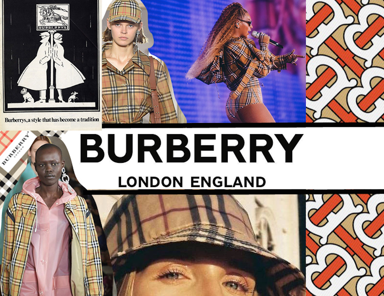
The answer? Riccardo Tisci. Formerly creative director for Givenchy, Tisci has taken over the reigns (and is evidently changing direction) at one of the UK’s most historic luxury brands. The 2018 logo, fashioned by graphic designer Peter Saville (also responsible for the 2017 Calvin Klein logo change), comes hand-in-hand with a new monogrammed print, delivering to us a significant rebranding of the name we know as Burberry. The tessellated pattern features the initials “T.B.” paying homage to the brand’s founder in 1856, Thomas Burberry. It’s vaguely reminiscent of a William Morris wallpaper, with the weaving typography being vine-like, and to quote Peter Seville, “the red and honey is a strong combination”. The print is quite nice, but unfortunately, the pairing with the new logo taints it a little bit. It’s also where most of the controversy lies.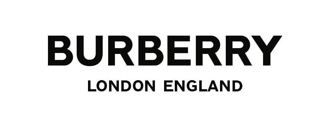 Truth be told, I don’t completely hate it. But it’s hard to actually feel anything of passion towards this logo because it’s so utterly boring and indifferent. Burberry has always existed in my mind as an old English fashion staple. Prim and proper, classic prep, the iconic tartan, bore by the upper English class. The old typeface is like an old grandfather clock or the cover of an old Dickins novel and that majestic medieval equestrian knight simply solidifies it. Call it old-fashioned but…yes! Call it old fashioned! That’s exactly what it is and there’s not anything wrong with being a veteran in British fashion and being candid about it.
This new logo is contemporary, modular, and a little Fendi-esque (though unlike the Fendi logo, you’d likely fall asleep looking at this one). It’s certainly different to the old one, but to call it different isn’t to say it’s unique. Again, we’ve seen similar things on Fendi, on Comme des Garçons, on YSL, what Saville has done recently with Calvin Klein, and that’s just in the fashion industry. I’m sure I can find some insurance companies with this titular font… Case in point: it’s generic. All caps, bold, sans serif – yawn. But worse than being generic, it’s changed precisely what made Burberry unique – a reference to its legacy.
But from the other side of things, Burberry’s move makes sense. It’s a brilliant publicity stunt. I applaud Tisci on how he executes the reveal on his Instagram. Splaying screengrabs of his email dialogue with Peter Saville, leaving hints of pattern’s red in the background as mere breadcrumbs for us to drool over. And the controversy that has unfolded as a result is not intense enough for the brand to scrap it altogether (think Gap’s 2010 redesign failure) but leaves them at a balanced see-saw. Some positively love the change. Some are repulsed by it (one of my favourite insults being an Instagram comment saying that it looks like the logo was made on Microsoft Word). And Burberry can probably live with the haters because:
A. You can’t please everybody
B. A change this dramatic commands attention
C. Even bad attention is attention
View this post on InstagramA conversation between #PeterSaville and #RiccardoTisci
A post shared by Burberry (@burberry) on
View this post on InstagramDiscussing the #Burberry archive . #RiccardoTisci #PeterSaville
A post shared by Burberry (@burberry) on
View this post on InstagramThe #ThomasBurberryMonogram pattern revealed . #RiccardoTisci #Burberry
A post shared by Burberry (@burberry) on
Now, everybody is talking about Burberry. And apart from it being relatively commercially successful, how much did we really talk about it before? Maybe a trench coat here or there, but otherwise, not exactly one of our millennial lust-worthy brands. And this certainly brings it into the limelight. The iconic tartan pattern is popping up more and more (hello Beyoncé). Let’s hope that Tisci’s plans to recreate the brand brings relevance, without completely tarnishing Burberry’s historic identity. I mean…don’t call it a comeback, but maybe that’s exactly what Burberry needs it to be.
