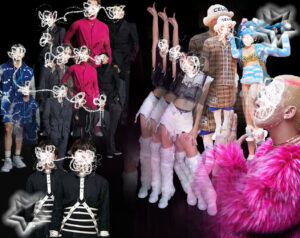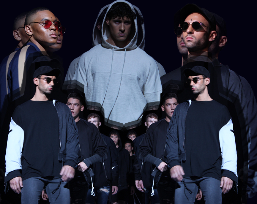
Toronto-based brand Kollar Clothing presented it’s Spring Summer 2018 collection during TOM* fashion week this past September. The men’s streetwear brand is known for it’s casual, simplistic style, and high attention to fit and detail; and this season was true to kind. Similar to past Kollar collections, wardrobe staples like long tees, hoodies, and light jackets were prevalent throughout the show, exhibiting the brand’s trademark easy-to-wear aesthetic. Kollar’s SS’18 collection featured fitted jeans and joggers, graphic printed tops, and bomber jackets. Neutral colours such as black, grey, and brown dominated with a few colour pops in the form of blue denim, and graphic details. The garments were clearly impeccably executed (not that it’s hard to make a good quality tee these days) however in all honesty, not exactly revolutionary.
All in the Details
One major appeal of Kollar clothing is the little details. Elements of clothing that are present but not imposing, delicate but noticeable. For example, many of the pants in this collection had small zippers around or at the ankles, or contrasting coloured panels. These panels were included down sleeves, on the backs of tops and jackets, or down the sides of joggers and jeans.
Is This West 49?
Like-coloured panels were used on many of the hoodies. Another major feature in this collection were laces. Small portions of lacing went up the sides of some of the tees, extra long hoodie strings were left hanging from the hood and around the hem. Drawstrings were left to dangle off the waists of pants, and some were even used as belts (this was reminiscent of our high school days when all the *cool* guys wore similar styles from West 49) .
While all of this detail is somewhat interesting, are any of the actual designs much different from what we have been seeing from men’s streetwear recently? Frankly, many of the pieces are quite interchangeable with the Google image results for a search of “men’s streetwear” and similar styles can be seen on quite a few other urban runways.
Quality & Care Doesn’t Cut It
That being said, the collection was well-constructed and it’s evident a lot of care went into quality and fit – a minor redeeming quality. But when it comes down to it, is quality really that redeeming if we’ve seen it all before?
Anyone familiar with Kollar will recognize the brand’s loyalty to a few key recurring design elements. Distressed denim and layered tees are a big part of every collection, and dropped shoulders persist from previous Kollar seasons. Will they ever die? We don’t know.
Fast Fashion Anyone?
The minimalist colour scheme of this collection is also classic Kollar and the restrained graphic elements are characteristic of the brand attempt at engaging a more colour-savvy audience. While there is comfort in predictability – consumers love when the classic staples of a brand recur every season – these streetwear looks are so wearable we don’t actually need to go to Kollar exclusively to get them. Similar garments exist season after season at H&M, Zara Mens and Urban Outfitters, so it’s no wonder we are comforted by their presence on a runway.
Cultural Cringe
At TOM*, models who walked on the Kollar runway were sporting more than just clothing. Outfits were paired with sunglasses, baseball caps, and sweaters with their hoods up. Interestingly, the models also all had a thin, vertical black line drawn down their foreheads. While the meaning behind this is not entirely clear nor explicitly stated, this could be a reference to a wide variety of religious and spiritual forehead marking practices.
The significance of the mark depends on the order they belong to, but many symbolize or reference the third eye, which sees spiritual truths. As well, the forehead is significant to some of these practices as it symbolizes the human brain and thus the imagination. Altogether, it would be difficult to say definitively what the meaning is behind this choice in marking since the designer never explicitly explained the purpose in any show notes. As well the importance of the mark can change based on the material used to draw it, and the direction the mark was drawn in.
There is also the possibility that there’s no significance at all to the markings and that they were a purely aesthetic choice on the designer’s part, but the presence of any facial markings that resemble that of a religious ideology clearly not the model’s or designer’s own, makes us feel a little….icky. We are not by any means screaming cultural appropriation, but using design details like this and not providing any explanation as to their relevance is a very grey area we would prefer designers be aware of (and clarify) in the future.
Predictably, Playing it Safe
Overall, this season’s collection was urban and wearable. The looks were predictable and played it safe within the box of current streetwear trends. The garments were well-constructed and on-brand for Kollar. A lot of our editor’s can see their boyfriends running to the store to buy these pieces, or going to H&M to find something less painful on the pocketbook. But a lot of us also agree that the level of safety demonstrated by the Kollar design team this season, was to put it bluntly, disappointing.
In a see of ready-to-wear pieces, and typical garments made for the fickle, fashion-timid man, this collection probably appealed to the guys who wanna look cool while not standing out. But as a city viciously fighting for international respect and attention from the global fashion elite, our designers have to do much much the originality department if they want any hopes of being given international attention in the future. Next season, let’s be adventurous.
Feature graphic created by Krizia Peluso.